Categories
Core Design Philosophy

Core Design Philosophy: Keep It Fun!

All children are born artists, the problem is to remain an artist as we grow up.

– Pablo Picasso

This is truly one of the cornerstones of my design philosophy and I know this in direct defiance of the stereotypical artist or creative suffering for their work. If you let it, any creative job will become drudgery. As difficult as it may be at times, keeping a lighthearted and playful approach to your work is key to avoid falling into such a trap.

Reason 1: Keep an open mind

Keeping an open mind is the primary reason why it is so important to keeping design challenges a little playful. Simply put, it keeps you open to as many and as various possibilities as, well… possible. Sir Ken Robinson conducted a famous study that evidences the fact that as we grow up, we see a smaller and smaller set of possibilities (convergent thought). Even using the phrase “Grow up!” is such that the person saying it is telling you to see it just one way, usually being their own way of seeing the situation. The fact remains that when you see only one answer to a design question, you are neglecting an infinite amount of possibilities before you have even explored any of it. A good design process, being one that explores the possibility of design solutions. Or better yet, to redefine the design question altogether to one that can be more easily solved while adding another element to the final execution.

Reason 2: Explore the uncomfortable

The secondary reason to maintain a lighthearted and playful approach to your work is that it helps to explore parts of the project that you may feel uncomfortable exploring in a straightforward manner. In my experience, a golden example of this is the discussion of bathroom and bedroom habits. We all have these habits and yet we all feel so uncomfortable communicating them. These are important habits to explore if you are working on designing either of these types of rooms. As such, I suggest that you channel your inner child before you experience the discomfort of talking about such habits. Take the chance to explore what a bathroom or bedroom can be, and if you cannot do it as an “adult,” then use a little child-like humor. Potty humor can be a very good communicator of potty habits!

Reason 3: Life is difficult enough without making it more so

The third reason is that there is enough difficulty in life. If you spend the time dreading what ill may come, you do not open yourself up to a project’s true potential. By staying a bit playful, even the most dreaded tasks become less bothersome. For example, if you get too hung up on that morning commute, you will inevitably bring that negative energy to work generally dragging down the quality. Perhaps, turning that car into your personal karaoke booth can really help you rock it at work!

Reason 4: Help that energy last the whole day!

The fourth, final, and purely practical reason to this approach is that it gives you a bit of energy to spare at the end of the day to celebrate getting through! It also tends to energize the whole team you work with so that any after-hours business talk can happen without the conversation devolving into negativity. To quote Johnny Mercer and Pied Piper (or more famously Bing Crosby) Ac-cent-tchu-ate the positive!

And a special thank you to…

I feel that it is important that I credit this philosophy to my voice teacher, Karen Huffstodt, who helped me develop it. Karen adopted this core teaching philosophy from David Jones, who in turn learned it from Allen Rogers Lidquest. Lidquest’s philosophy of teaching was as follows:

“We teach the entire person, not just the voice. It is critical to work with a joyful and positive attitude, making learning a positive experience.”

– Allan Roger Liindquest

It is not only the whole body that tightens up to stress but also stress hinders the mind’s ability to feel ready to explore within a feeling of safety. Thank you, Karen, for teaching me in such a way, as it taught me to explore how to redefine the design questions altogether.
Categories
Interior Design Portfolio

UES NYC Apartment Reno, Decoration & Staging

Out of 2020 I finished my first full apartment design, renovation, and staging under my own label. Though I know this is a small accomplishment to some, it is something I am very proud of! And there were many fun design challenges in the process.

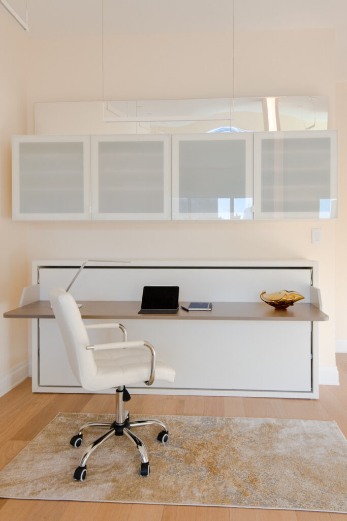
The Home Office

The part of the apartment I truly covet, second only to the kitchen: the home workspace. But this workspace has a few tricks. Scroll down to see the Murphy bed in action!

I know, I know: we’ve all seen enough of our own home work station. That being said, this one has a few tricks, not to mention it was a perfect desk to work at while we were staging the apartment. From firsthand experience, this desk makes a wonderful flower arranging station (which is also a great way to decompress from the stress involved in a construction project). Complete with task lighting from a pendant above the outlet and data ports to the left, this is truly a flexible work station/crash pad that is ready for any of your living requirement surprises through the next few years.

And You Thought It was Just a Desk…

In case you’re curious on how the Murphy bed folds down, I made this video. I decided to enclose a video because every time I showed someone how the bed worked, they took out their camera to capture the transformation. It was one element that my photography skills would not be able to catch. The Murphy bed unit is sold at Resource Furniture.

And the Fun Side of the Home Office!

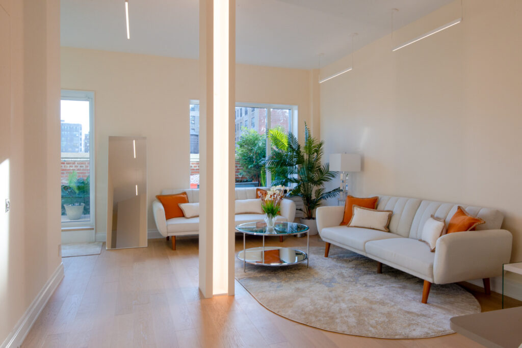
Living room with our first custom-designed light fixture. A large vertical source of light running from floor to ceiling, it evokes the design of the pendants throughout.

The living room is on the other side of the workstation so you can set up the Murphy bed as a day bed and make your work room into a swanky after hours lounge. Space is just too valuable in NYC not to have a little flex built in. Note that the terrace wall has a large set of lovely windows and a huge double door so that you can step out and take in the south-facing view.

Creating new flower arrangements was a great way to meditate away 2020’s stresses. Look forward to more staging projects!

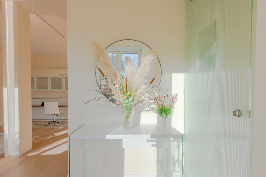
Above is the view that greets guests as they step back inside from the sun-drenched terrace, cocktail in hand. This is the real axis of the whole apartment as it is where the living room, bedroom, and the large terrace all meet. As such, it needed a special moment created through decoration. We decided on a flower arrangement and a console table, but a bench would also be a lovely option.

My Favorite Place: the Kitchen!

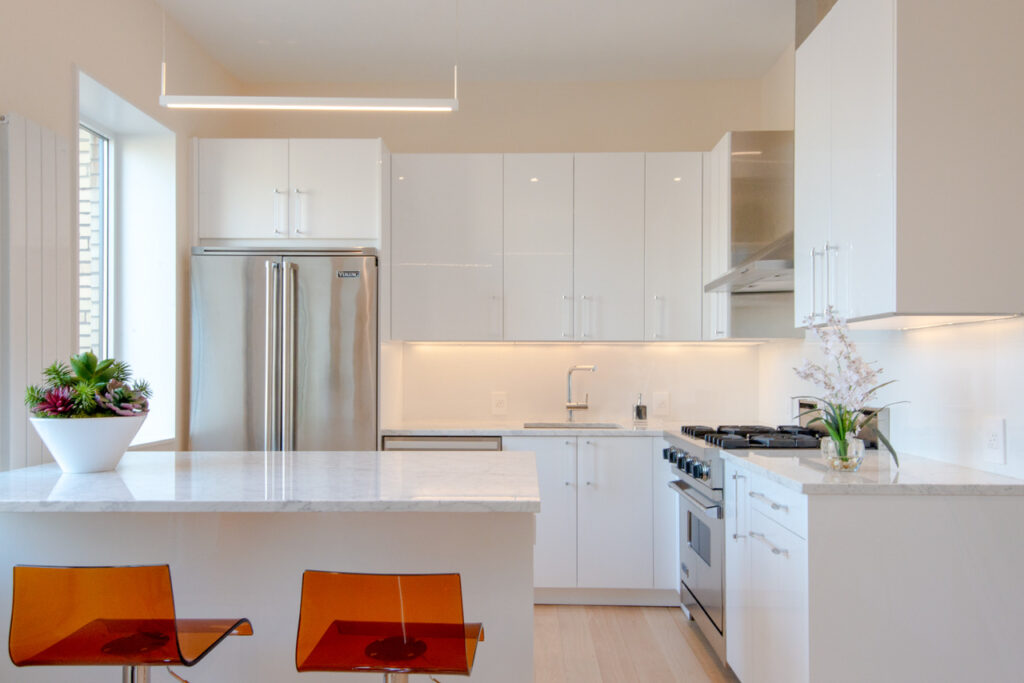
I love to design kitchens and it’s no secret that it’s due to my love of cooking. This design formed a compact ‘work triangle’ without being stingy in any way.

Due to NYC building code requirements, whatever kitchen layout you have is the one you are often stuck with. I believe that we were lucky that the layout of this kitchen was very functional. You can imagine the working triangle being formed with food storage by the refrigerator (which I might add is a beautiful Viking appliance, as is the range). The cooking space consists of the stove and the countertop to its right. The sink and dishwasher complete the third arm of the working triangle as the cleaning area. Not to mention, the white lacquer cabinets along with the Carrera marble countertops simply look stunning.

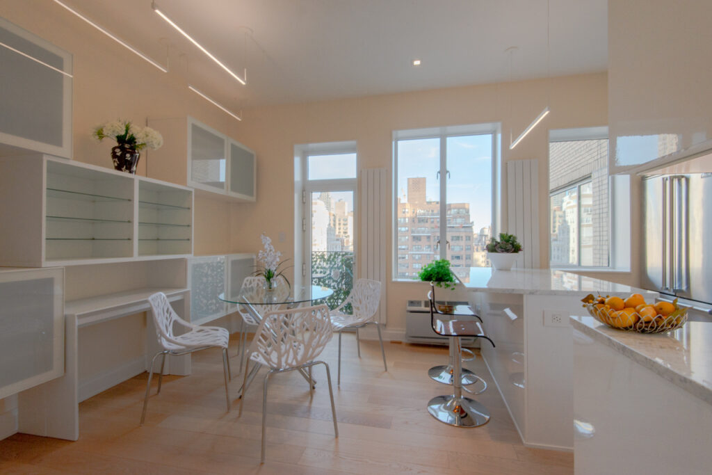
Upon first entering the apartment, guests view the lovely dining area and the glass door that opens onto the ‘cocktail terrace.’

Pictured above is the dine-in portion of the dine-in kitchen. Although the kitchen island was designed as the ideal breakfast spot, I also found it a lovely place to do some quick work on my tablet. And with the large windows and beautiful Runtal radiators, what is not to love? The space is both cool and cozy: no better place to have your coffee in the morning or a smoothie after sweating it out doing yoga on the terrace.

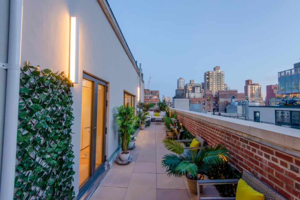
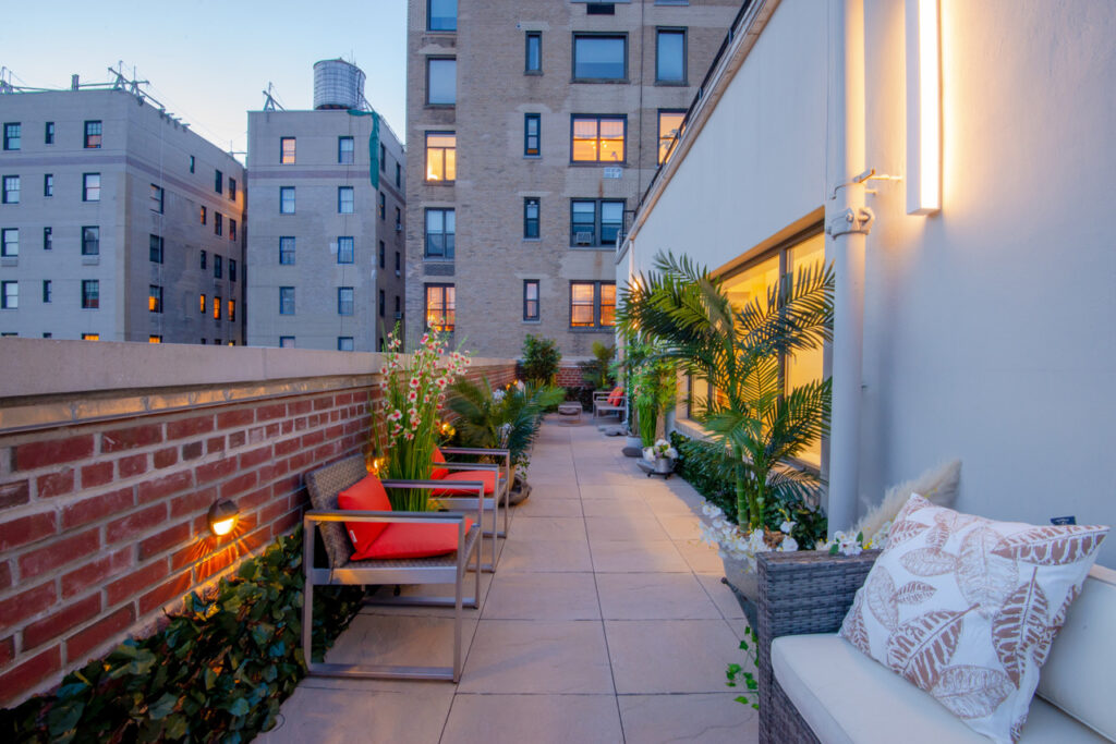
Shot #1 of the terrace. This one’s dirty little secret? All the plants are fake! But they really do give the illusion that you’re lounging in a lush jungle even in the thick of a NYC autumn… Just ignore the shivering and the chatter of your teeth.
Shot #2 of the terrace. This corner is a comfortable private lounge. It really feels like an outdoor drawing room.

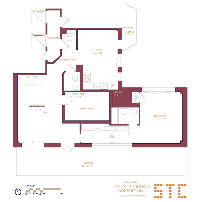
Floor Plan (as I am a Draftsman/CAD Nerd)

Here is the floor plan for good measure.

As you can see above, the layout is a little tricky as it wraps around a fire stair. Fortunately, it does not suffer from the typical bottlenecks as it has closets, built-ins, and windows in all the right places. As a result, this apartment is split into three different sections: the dine-in kitchen, the living room/terrace entertaining area, and the private bedroom/dressing area. This spacious penthouse apartment becomes a luxurious one-bedroom and as ideal as it gets as a pied-de-terre. Either way, I’ll sign off with these last two photos.

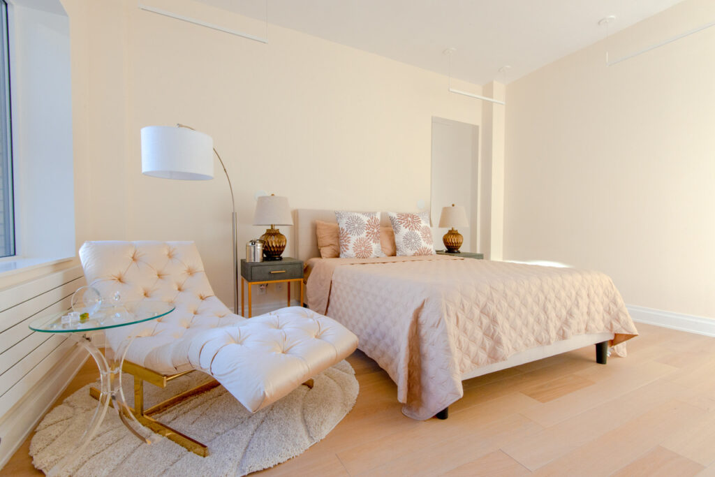
Here’s the private bedroom. Just in case lounging in bed wasn’t relaxing enough, we also set up a chaise-longue for reading the morning paper or you know… enjoying an afternoon martini.
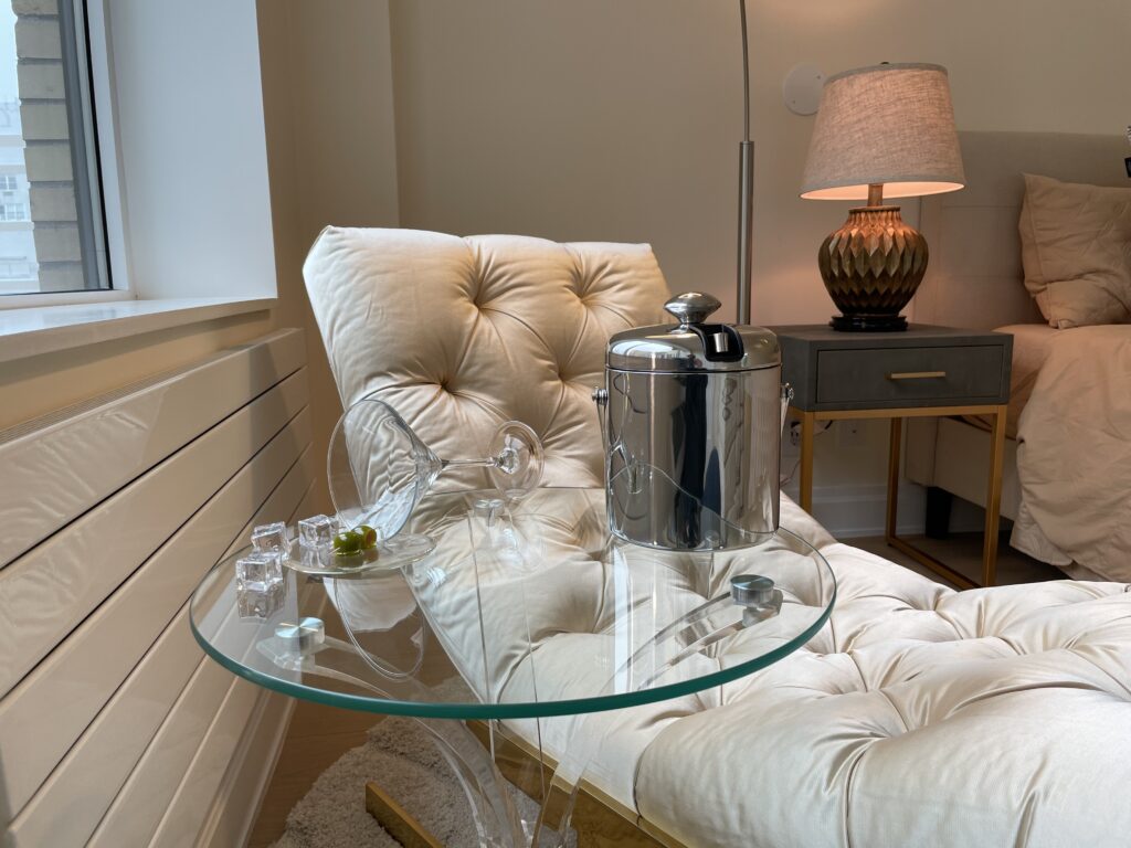
Wow, looks like you made it all the way to the end. Try saying ‘teeny-tiny martini table’ five times fast after three martinis (without spilling the fourth… whoops)!

Categories
Interior Design Portfolio

Ode to the small projects

Small but not small in our hearts, it’s the tiny projects that keep us going, help us to learn and give us a foot in the door when it comes to trying something new. Sure they may not be big , but without them, I can honestly say there would be no way to take on the big projects. Hopefully you enjoy them!

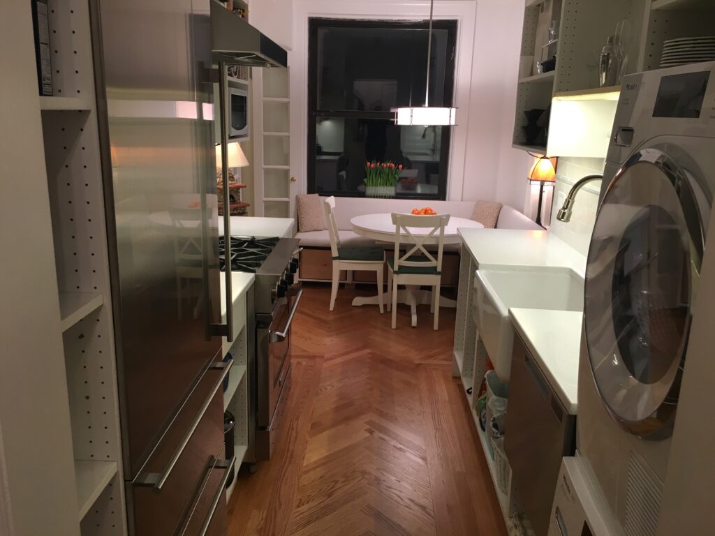
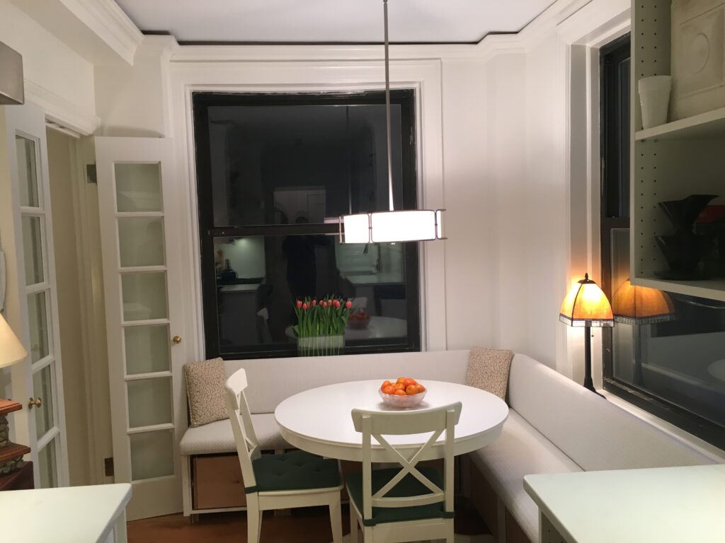
Upper West Side Kitchen NYC

entry of the galley kitchen in a lovely Upper-West Side of Manhattan apartment

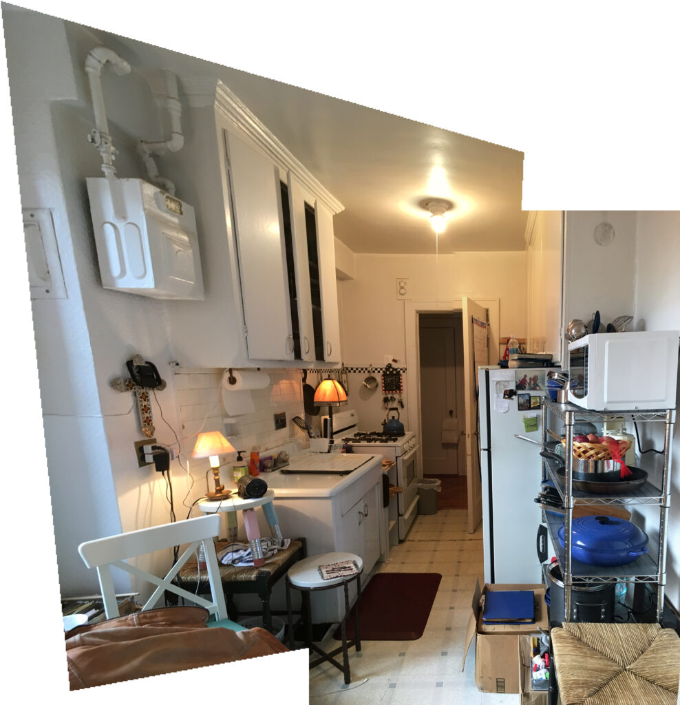
For example, one can see a small kitchen renovation project. This kitchen was initially many years paster an overhaul. It went from being a largely inefficient utilization of space to being modern, stylish, having plenty of workspace for a kitchen its size, and on top of all of that have a washer/dryer set installed. I would be happy to cook a meal in this kitchen. Note lovely barn sink and practical and practical subway tile backsplash.

Upper East Side entertainment room NYC

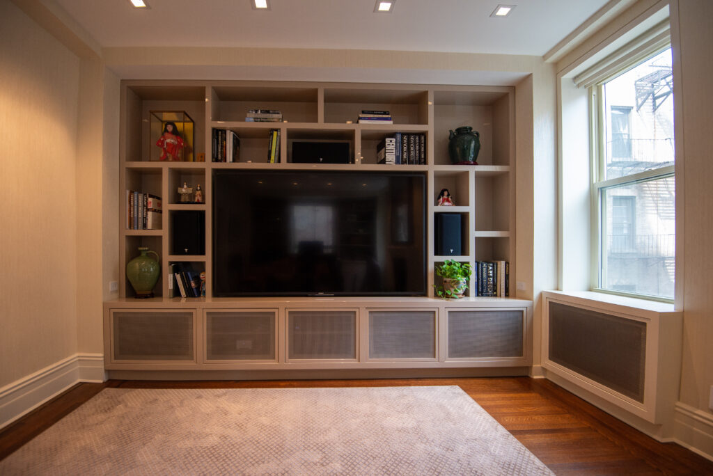
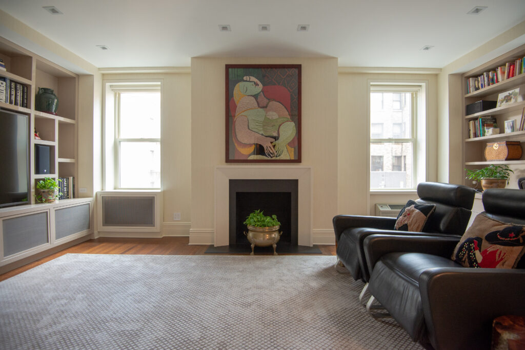
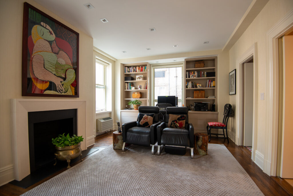
Luxury media room / office rework in the Upper-East Side of Manhattan

Another example was this design of this TV wall unit. The scope expanded from designing and building the cabinet to overhauling the whole room: new light fixtures, new fireplace, new wallpaper, and refurbishing the office space cabinets. The most unique feature of this wall unit includes a wire mesh fascia to allow the hifi AV air circulation keeping the electronics cool no matter how loud you play the music out of these lovely speakers. Keeping the speakers as close to seated ear-level as possible, you really get grabbed into whatever TV show you are watching or music you are listening to. I pushed the client a little towards asymmetry to allow for a more whimsical display of their art and books. We also lucked out as the client had the perfect piece of art to hang over the brand new mantle. Either way, don’t assume that any job is too small for me: just reach out and we will discuss!

Categories
Food

Lookbacks to 2020, the year in grilling

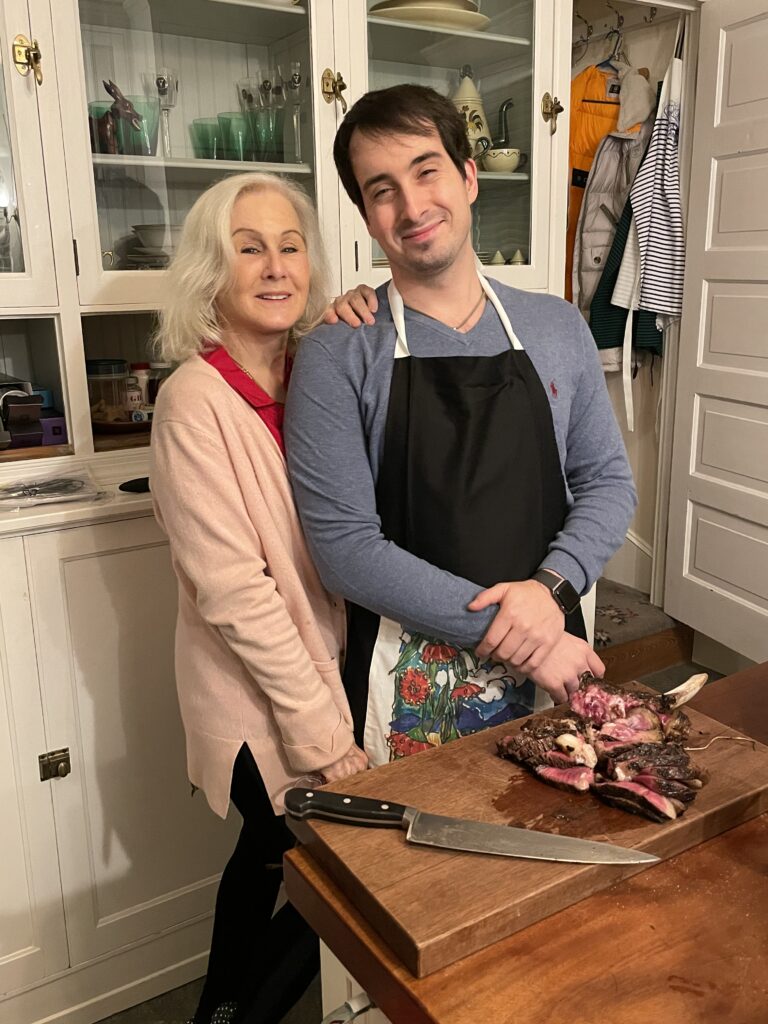
Some delicious tomahawk steak with my mother. As you can tell we like it pretty rare!

Even if in the last year I only had one catering gig, I did not feel as though I got left behind in developing my cooking skills. At the beginning of quarantine, like many, I dived straight into my cooking. After learning how to make several new pasta dishes from scratch (aglio e olio w/ shrimp being my favorite), and a few week attempts at making meringues my rolling boil of a cooking attempt died down to meek simmer. The reason being is that I suddenly found myself only able to worm into pants with elastic. But I found one haven out of one piece of bad news that 2020 brought: my oven in Pennsylvania stopped working…

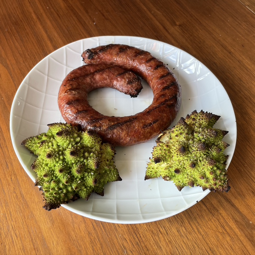
The old-fashioned breakfast sausage (AKA country sausage) with the new-fashioned romanesca (fractal-formed cousin of the quotidian broccoli)

So armed with only a grill, I endeavored to make many of the meals my girlfriend and I shared. Our favorite staple quickly became thick sliced zucchini ‘steak’ and pork chops. And of course steaks and normal vegetables were easy choices. But in order to make what was a collection of what felt like side dishes into a full meal was going to take more effort. I tried grilling bacon for example, but I found it looked much prettier in photographs than it tasted. But the first difficult grill challenge I took on was to grill a whole chicken.

As I have had a huge amount of experience roasting chicken through the years, I spatchcocked the bird, rubbed one of my typical spice mixtures on it (salt, pepper, cumin, paprika and garlic) and through the bird onto the hot section of the grill face down for an initial char. After leaving for a few short minutes, flipping it onto its back to sear the back. Then to finish it up, put it on the upper racks to slow cook in indirect heat.

I really need to be better at photographing food, because this looked 3 times as delicious in person!

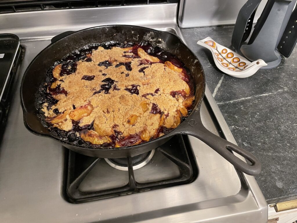
But the real achievement last year was baking in the grill. As you would expect the primary issue with doing this would be managing heat control. This was not so easy due to cold weather and hard wind conditions. Regardless, I found the trick was heavily greasing the cast iron skillet, and applying indirect heat. The recipe was just a typical blueberry peach cobbler recipe in which I substituted frozen fruits for the more typical fresh fruit ingredients.

Pre-heat the grill to the temperature the recipe specifies for, and set it so that the temperature is as close to steady-state as possible (without tweaking, won’t gain or lose heat but stay as the specified temperature). Now pop the cast iron with the cobbler and topping on the grill altogether. Resist the urge to open and check on it too often. In about 20 minutes into cook time, rotate the pan 1/3 rotation to assure even doneness (this is where you get to sneak your peak in). Repeat this step in another 20 minutes, etc. and cook until top is appropriately browned.

My favorite part of the whole experience: watching it bubble on the grill as I could smell all of those wonderful cobbler smells. #bubblebubbletoil&trouble

Categories
New Direction

Second Obligatory Post

I know, very exciting! Normally I would say that it’s hard to follow up a first act, but that doesn’t seem to be an issue in this case. Also, you may be asking why the penguin. Because all of our market research finds that cute animals with photos that match our color scheme do well! Well… maybe it’s the first photo from the collection we found that fit the mood we are trying to set. Speaking of market, we at Stone’s Throw now are developing three websites so it looks like we will have to up our interwebs game. One site is for a very experienced and specialized personal trainer’s new jump into the world of cyberspace and providing a larger part of his service to his dear clientele. Another one of the sites is a digital portfolio for a very accomplished opera vocalist who has decided she needs a stronger internet presence. Both people involved are brilliant, so it just means presenting them in their best light.

In fact, I made a little prototype of a social media video of yours truly showing off a really cool work station centered around a Murphy bed designed, manufactured and installed by #resourcefurniture. I then specified for upper cabinet storage above as well as a little bit of lighting hanging from the ceiling and a small desk light. Think my favorite part of the video is watching the open iPad as the desk is collapsed. Sadly, this belongs to a client and isn’t my work desk. At the end of the day, it would be pretty cool to just fold your desk/papers out of site to keep them out of mind and replace it with a cozy little bed.

#newyearnewdirections #happypenguin #beinthewatermyfriend

Categories
New Direction

Hello World! AKA not another design blog!!

Welcome to my first post… I know I’m disappointed to haha. 2020 has been a long year with it’s ups and downs. So what am I writing? Another design blog? Perhaps, maybe just felt my design practice needed some sort of website to go along with it. So read, enjoy and feel free to ask questions. I look forward to making 2021 a very different year for myself and those I work with. So hopefully you get a little entertainment out of this new exploration.

So let’s see what this year brings in this world a general administrating for Architects, designing apartments, designing a websites, drafting for cabinet-makers, and whatever odd-job comes my way. I’m sure it will be better than the last!

#zerotohero #stonesthrowco #toabetteryear