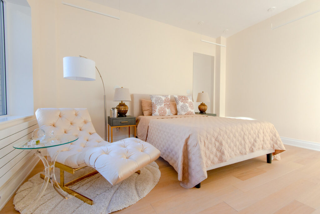
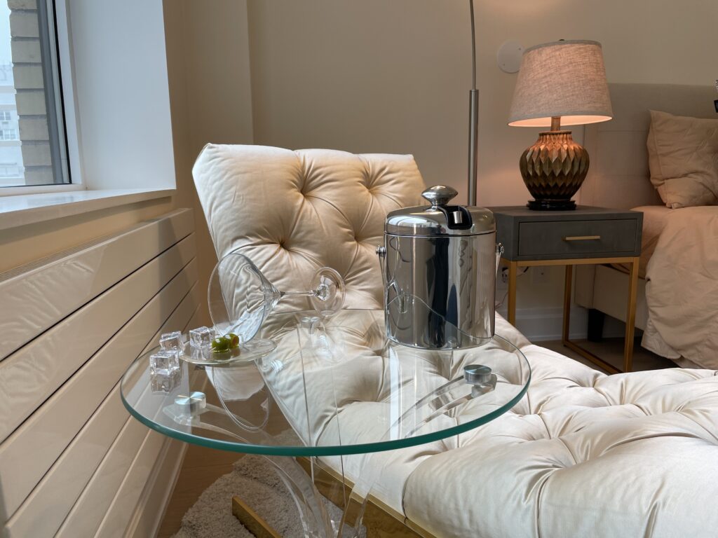
Out of 2020 I finished my first full apartment design, renovation, and staging under my own label. Though I know this is a small accomplishment to some, it is something I am very proud of! And there were many fun design challenges in the process.
The Home Office
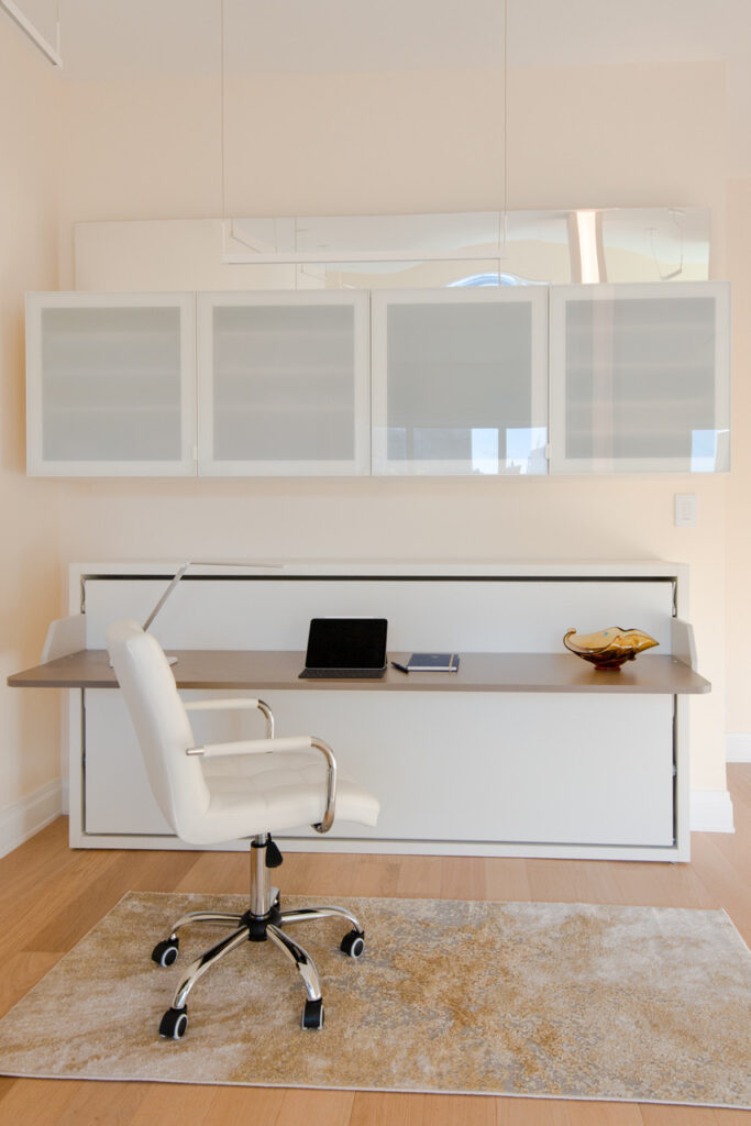
I know, I know: we’ve all seen enough of our own home work station. That being said, this one has a few tricks, not to mention it was a perfect desk to work at while we were staging the apartment. From firsthand experience, this desk makes a wonderful flower arranging station (which is also a great way to decompress from the stress involved in a construction project). Complete with task lighting from a pendant above the outlet and data ports to the left, this is truly a flexible work station/crash pad that is ready for any of your living requirement surprises through the next few years.
And You Thought It was Just a Desk…
And the Fun Side of the Home Office!
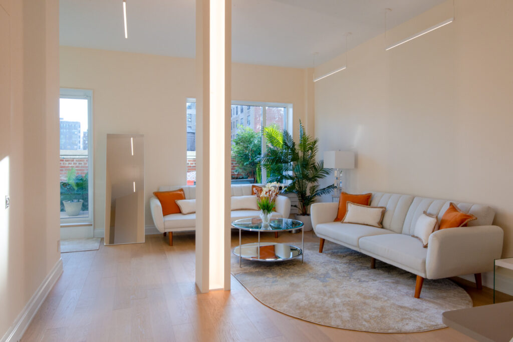
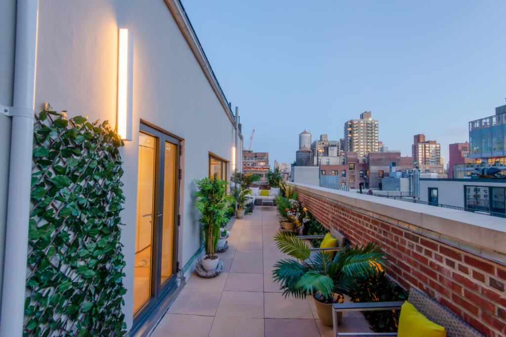
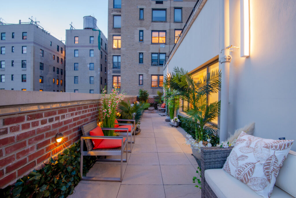
The living room is on the other side of the workstation so you can set up the Murphy bed as a day bed and make your work room into a swanky after hours lounge. Space is just too valuable in NYC not to have a little flex built in. Note that the terrace wall has a large set of lovely windows and a huge double door so that you can step out and take in the south-facing view.
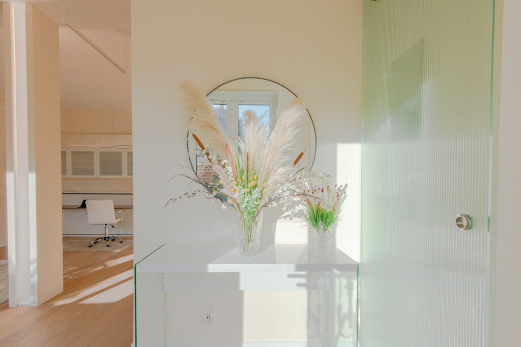
Above is the view that greets guests as they step back inside from the sun-drenched terrace, cocktail in hand. This is the real axis of the whole apartment as it is where the living room, bedroom, and the large terrace all meet. As such, it needed a special moment created through decoration. We decided on a flower arrangement and a console table, but a bench would also be a lovely option.
My Favorite Place: the Kitchen!
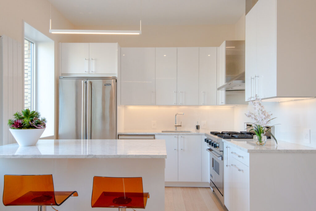
Due to NYC building code requirements, whatever kitchen layout you have is the one you are often stuck with. I believe that we were lucky that the layout of this kitchen was very functional. You can imagine the working triangle being formed with food storage by the refrigerator (which I might add is a beautiful Viking appliance, as is the range). The cooking space consists of the stove and the countertop to its right. The sink and dishwasher complete the third arm of the working triangle as the cleaning area. Not to mention, the white lacquer cabinets along with the Carrera marble countertops simply look stunning.
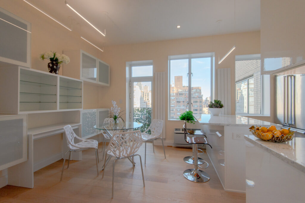
Pictured above is the dine-in portion of the dine-in kitchen. Although the kitchen island was designed as the ideal breakfast spot, I also found it a lovely place to do some quick work on my tablet. And with the large windows and beautiful Runtal radiators, what is not to love? The space is both cool and cozy: no better place to have your coffee in the morning or a smoothie after sweating it out doing yoga on the terrace.
Floor Plan (as I am a Draftsman/CAD Nerd)
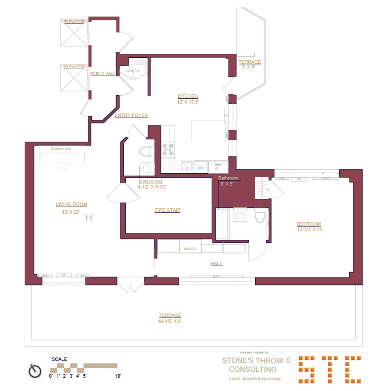
As you can see above, the layout is a little tricky as it wraps around a fire stair. Fortunately, it does not suffer from the typical bottlenecks as it has closets, built-ins, and windows in all the right places. As a result, this apartment is split into three different sections: the dine-in kitchen, the living room/terrace entertaining area, and the private bedroom/dressing area. This spacious penthouse apartment becomes a luxurious one-bedroom and as ideal as it gets as a pied-de-terre. Either way, I’ll sign off with these last two photos.
